Contents
In the rapidly evolving world of digital marketing, keeping up with the latest design trends can give your email campaigns a crucial edge. Today, people are bombarded with hundreds of emails a day, so to stand out from the crowd and capture the attention of your target audience, you need to visually craft your message. Insiders are already looking into the crystal ball for the next year, wondering what new trends will appear on their radar. In this article, you’ll get a chance to peek at the main email design trends that will emerge in 2024.
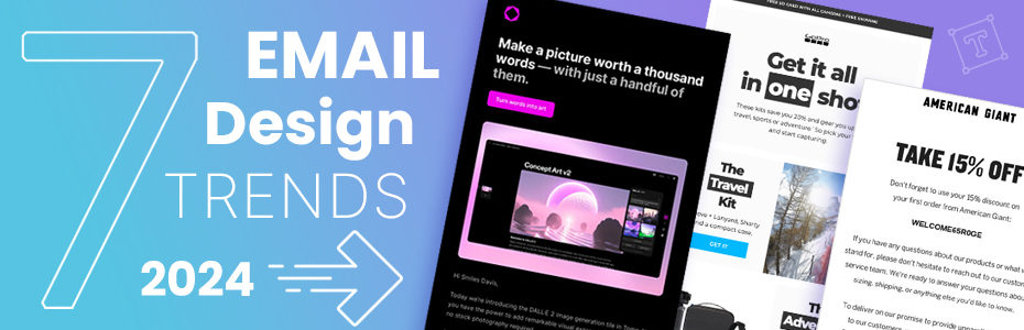
1. Custom Design with Artificial Intelligence
Lately, we’ve seen AI supporting email text writing, but the coming year is ready to witness how AI is changing the design landscape. The rise of Artificial Intelligence is still relatively in its early stages, but we can expect to see it integrated more often into email campaigns. Recently, some AI-generated images are already circulating when the storytelling directly involves artificial intelligence, or for example when a new feature of a technological product is released. Example – Tome
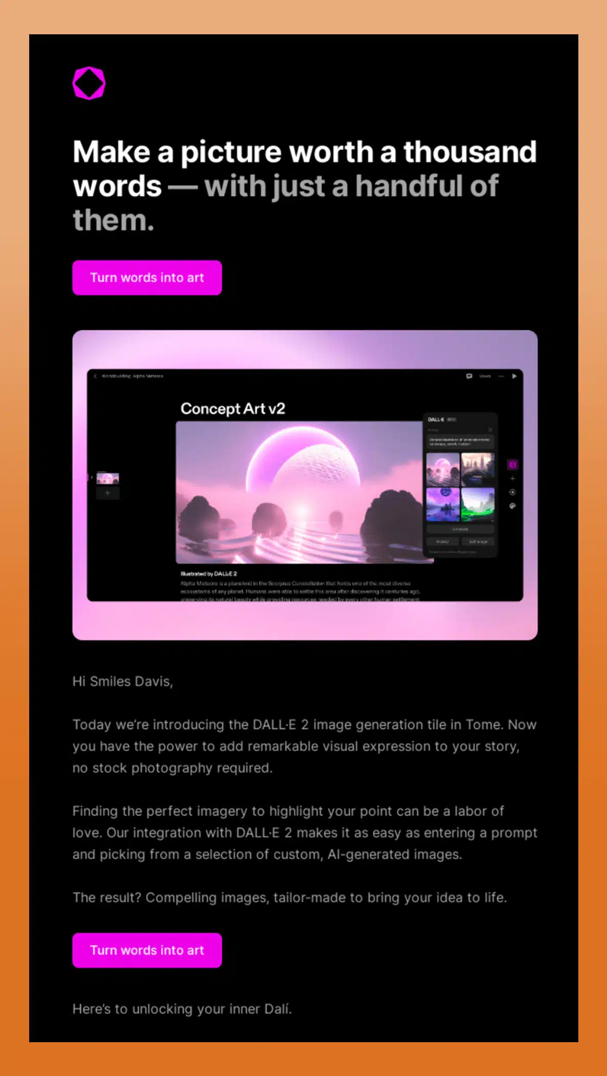
2. Dark Mode Compatibility
Dark Mode, or dark setting, is a feature that changes the color palette of an interface, making the content high contrast by using dark backgrounds and light foreground colors. Essentially, compared to the usual use of desktop or mobile apps, bright backgrounds transform into dark shades, and black text becomes white to favor contrast. With more and more users setting this option as default on their laptops and smartphones, ensuring that email templates are compatible with Dark Mode will be one of the absolute priorities in the coming year. Here are some tips to apply in the design to favor readability in Dark Mode: Logo: If the logo is dark, add a light border to make it stand out in dark mode. Icons: It is recommended to use white outlines around dark design elements so that the white outline is not visible in light mode, but only in dark mode. Images: Use PNG with a transparent background, avoid using images that match the background color in the html. High contrast colors: Make sure that the text and design elements have enough contrast against the background to increase readability in both light and dark mode. These are some of the key points to consider to optimize email design for Dark Mode, which aims to ensure comfortable reading both day and night. Example – Litmus
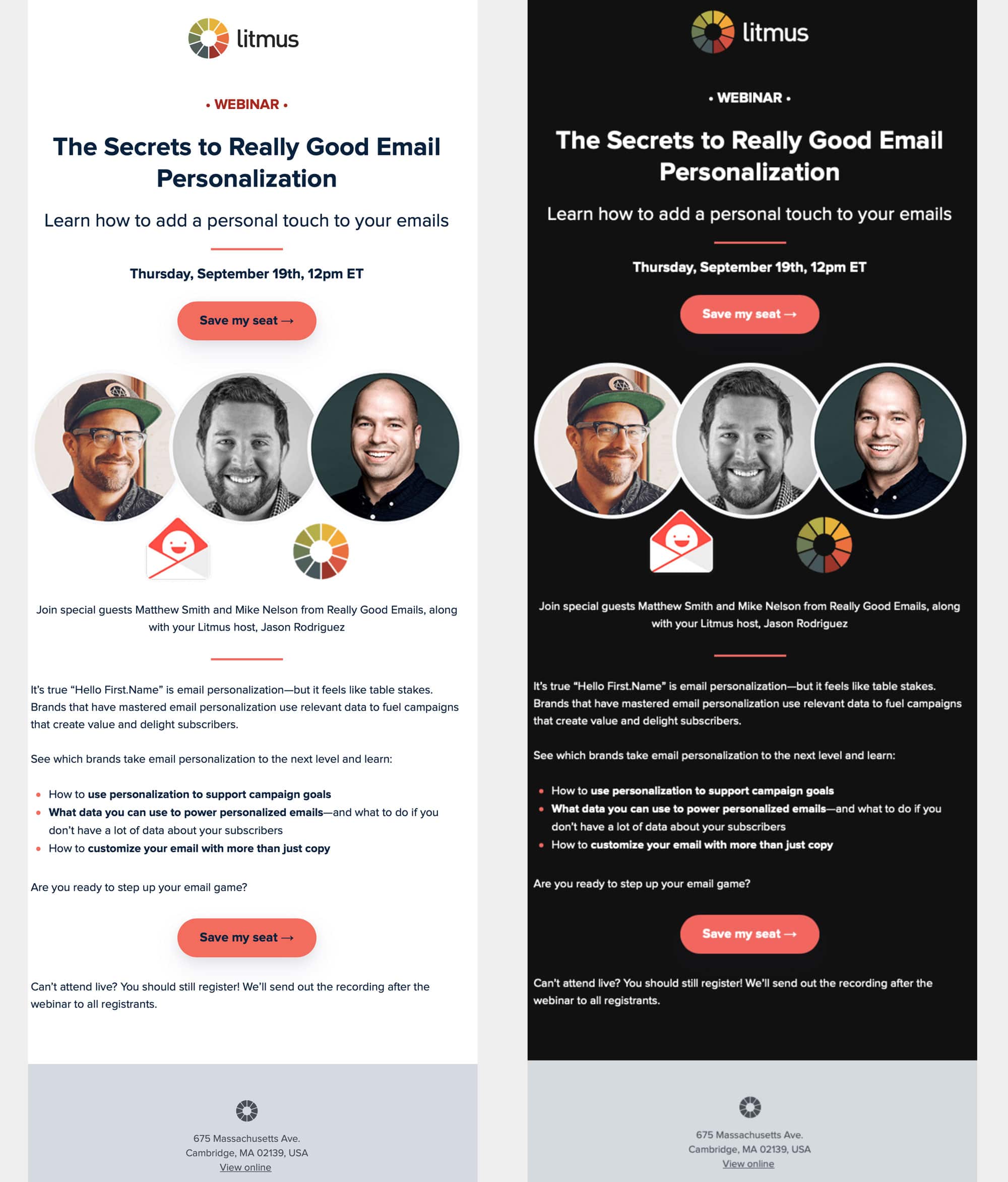
3. Use of Negative Space and Simple Structures
For several years, most users have been reading emails on mobile devices. This has led to the spread of responsive design, which transforms any multi-column layout into a single-column layout on mobile devices. As a result, designing a single column or at most two-column layout is beneficial due to its lighter code and does not disadvantage mobile-oriented users. This trend accompanies the balanced use of negative space, also called “white space”, to separate the different areas of the layout, giving “rhythm” to the contents of the email. Here is an excellent example that combines the choice of a simple structure with a clever usage of negative space. Example – Feather
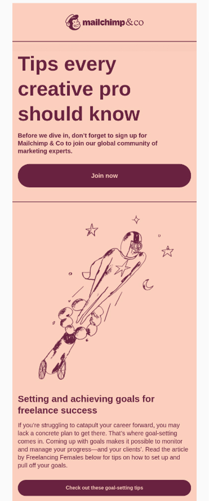
4. Monochromatic or Duotone Palette
Monochromatic or duotone color palettes can offer visually captivating images. The simplicity of a single color or the contrast of two colors can make your email stand out in the inbox, grabbing the attention of your subscribers. Different shades and tints of a single color can create a cohesive and harmonious design. Choosing just one color and a range of 2 or 3 shades, in fact, offers the advantage of clearly separating the different parts that make up the message. Example – MailChimp
5. Accessibility and Inclusivity
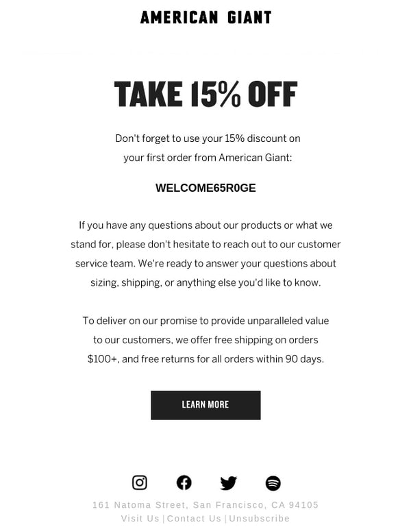
In the search for innovative, minimalist, or flashy designs, accessibility can often take a backseat. However, designing emails accessible to a diverse audience is not just an ethical choice, but also a strategic one, helping you reach a broader audience and promote inclusivity. A well-structured email, with readable fonts, clear color contrasts, intelligent use of white space, and a logical hierarchy, can significantly improve the user experience. It is therefore advisable to use larger font sizes, opt for easily readable fonts, and ensure adequate color contrast for better visibility. Furthermore, it is important to remember that alternative text for images in emails is crucial for screen readers used by email users with visual impairments. Including them not only makes your emails accessible but also improves their performance in cases where images are blocked or load slowly. Example – American Giant
6. Typography in Design
The wide readability of web fonts makes the use of lettering and typographic characters an effective method to distinguish your emails, reinforce the main message of the campaign, and the identity of the brand. The use of “bold” typography in emails acts like a lighthouse in the night: it illuminates key messages amidst a sea of text and provides a clear point of reference to the user, guiding them towards the main calls to action. Example – GoPro

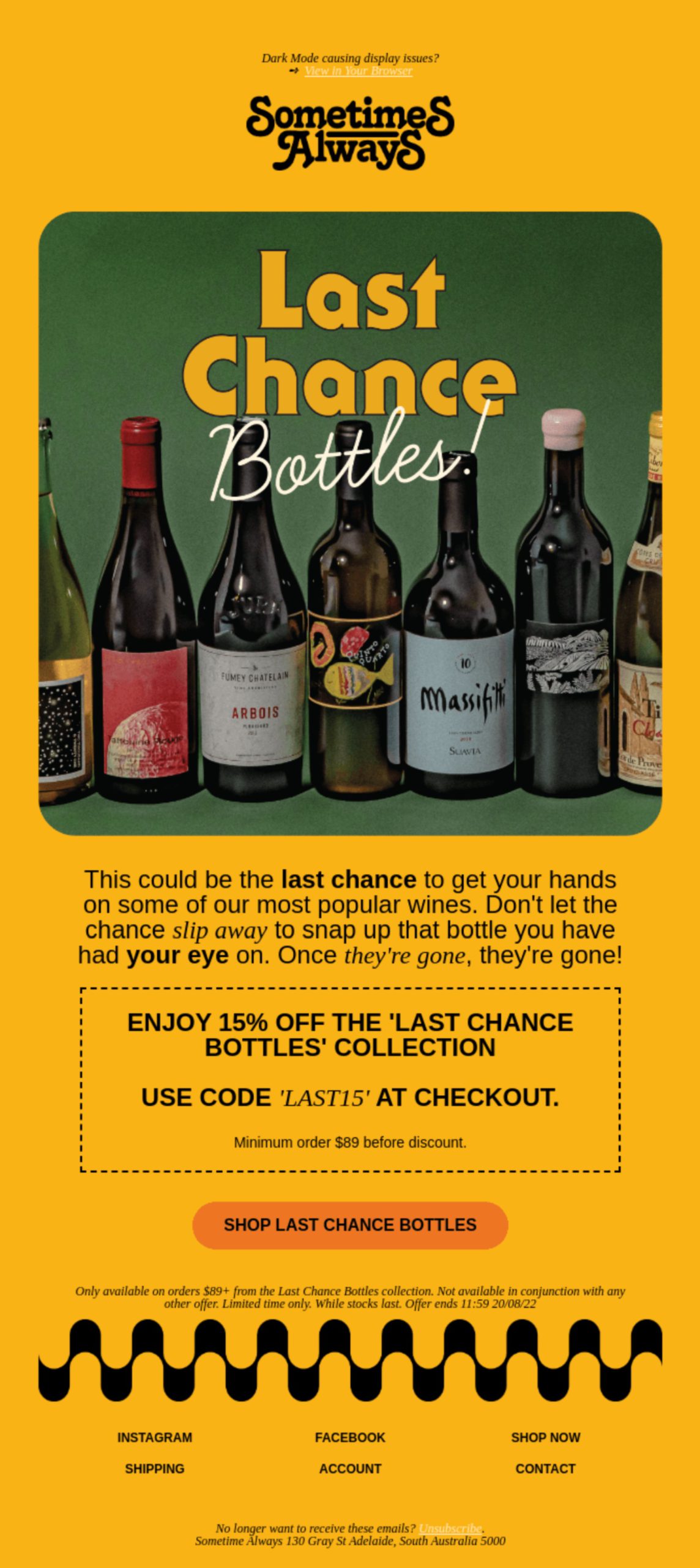
7. Retro and Vintage
The world we live in today is going through a transition phase: what was considered old is now trending. Be it high-waisted jeans or hair bands, people seem to be gladly celebrating the past. A trend that is coming back into fashion is vintage photography. From the boom in Polaroid camera sales to retro-style photos on Instagram, vintage can be found just about everywhere. The design perfectly shows what we’re talking about. Example – Sometimes Always
Conclusion
In 2024 email design, we will see a mix of vintage and innovative styles. Artificial Intelligence will play a greater role in visual creation, while Dark Mode, simple layouts, and emphasis on typography and accessibility will make emails engaging for a broader audience. The future promises a deeper connection experience with users, mixing the past and innovation. Constant adaptation to trends and the ability to capture attention in an increasingly competitive landscape could be the keys to the success of email campaigns in the coming year.