
Why my email is not read?
Maybe it is, and you don’t know it?
From its beginning, the email marketing has passed many obstacles and riched many objectives, changing its strategy and methods. But what hasn’t change over time is the main goal of marketers: to ensure the email’s reading.
There are some important aspects that you should know before diving in the analysis:
- When an email is readed by an ESP (Email Service Provider)? Currently the reading is confirmed when it’s downloaded at least one of the present images or when it’s interacting with the message, usually through the click.
- So these users have actually read the message? They could be. But remember that some mail clients now provide automatically to download images, advising the ESP of the opening.
- And all the others have not read the message? Not necessarily. Some users restrict its tracking and others read the messages without downloading the images. For example, the Apple Watch emails are available only in text format. Its users are not controled and, through them, can hide real readers.
Making these observations based on the value and reliability of open rate, you don’t think that a message can lose its effectiveness if the images are not downloaded. Readers can still be encouraged to perform an action. That’s why is very important to optimize the messages also for the “Images Off” version. They should be readable, identifiable and easy to continuing the pending action.
See this smart way to design an “images off” email:
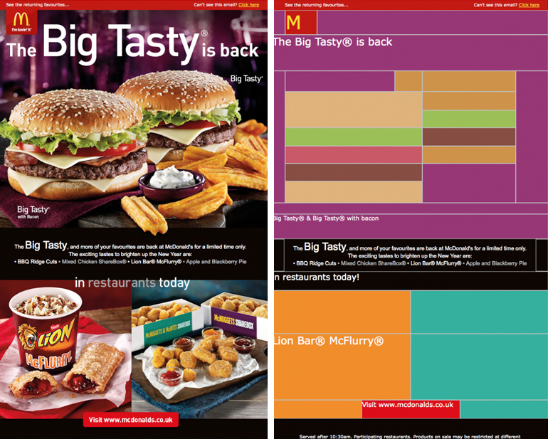
We loved this McDonald email! Using the table cells, it could re-create, in pixel art, the experience of a Big Tasty even for readers without pictures.
On the other hand, we cannot always afford to create an “images off” email, so we have to ask ourselves which are the most important aspects for a great design?
- Recognizability by using a clear name and email. In this way, the contacts will immediately recognize you (and no reply is always a bad idea).
- Highlight the emergency and importance in the subject. We’ve said it many times: the subject is the first thing that the reader will see and is the key factor between the inbox and trash!
- Use with creativity alt text and background color. Although not supported by all clients, a colored background will highlight your message overview.
- Use the preheader to anticipate the main theme and to empower the subject.
- Enter the main informations at the top of the email, to be sure that regardless the design, the reader will see them immediately and before leaving the message.
- Also in this case, frequency and timing are essentials. To know and satisfy the user’s preferences will improve the opening rate and interaction of the message.
- Of course, remember to test the message in the “image on” and “image off” mode.
In conclusion, blocked images are one of the challenges that an e-marketer has to deal with, but doesn’t mean that creativity should be set aside because you’ll stand out through it.