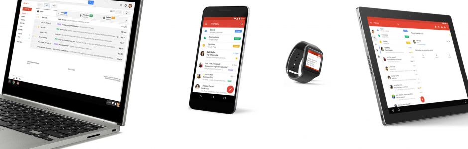
On Wednesday, September 14, 2016 was the official announcement: it’s ready the Gmail and Inbox upgrade that will support Responsive Email, whose content will fit now on all devices, depending on their size.
 Texts, links and buttons will have larger sizes to fit more easily on small screens. Even the desktop users will find improvements, the emails designed for mobile devices will also fit to larger ones.
What means for the Designers this upgrade? Now we can finally use CSS media queries to format the email to fit on all the devices. Not all the media queries will be supported by Gmail and Inbox, in fact Google has consulted a group of Email Designers agreeing on three important media queries: width, rotation and resolution, which will allow to obtain different results of the formatting output.
The complete list of the CSS rules supported by Google and Inbox is available in the developer documentation.
For example, the CSS below applies the color red when the screen width exceeds 500px:
@media screen and (min-width: 500px) {
 .colored {
 color:red;
 }
}
The impact generated by media queries, has made to pass unnoticed another significant new feature: now, the css styles can also be loaded from external sheets, which means that the weight of the sent email will reduce significantly.
Finally should be mentioned that Google is not the first supplier to adopt the CSS Media Queries, but despite this, there are email clients, like Outlook, that not yet support this technology.
 Email Marketing Database: every day a new deal
 Christmas in November: a B2B marketing opportunity to plan ahead
 Email Marketing and Open Rate – is the email subject a good analysis parameter?